MISSION: Fan the flames of sustainable growth through a synergy of creative flair and analytical proficiency.
Style
Elegant
Slightly Edgy
Clean but unique enough to stand out in a saturated space that lacks many professional-looking brands
Legible Gothic
Additional Notes
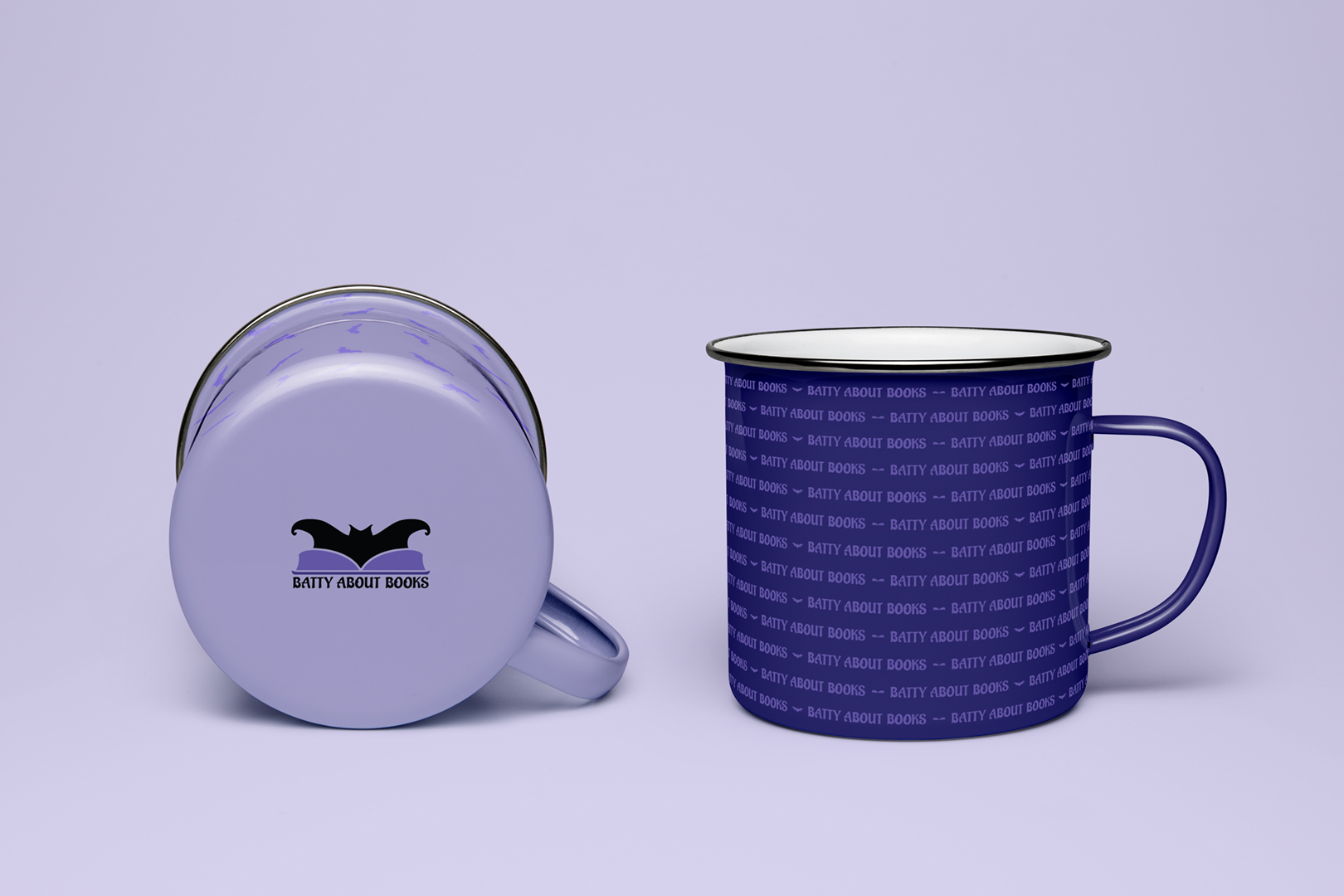
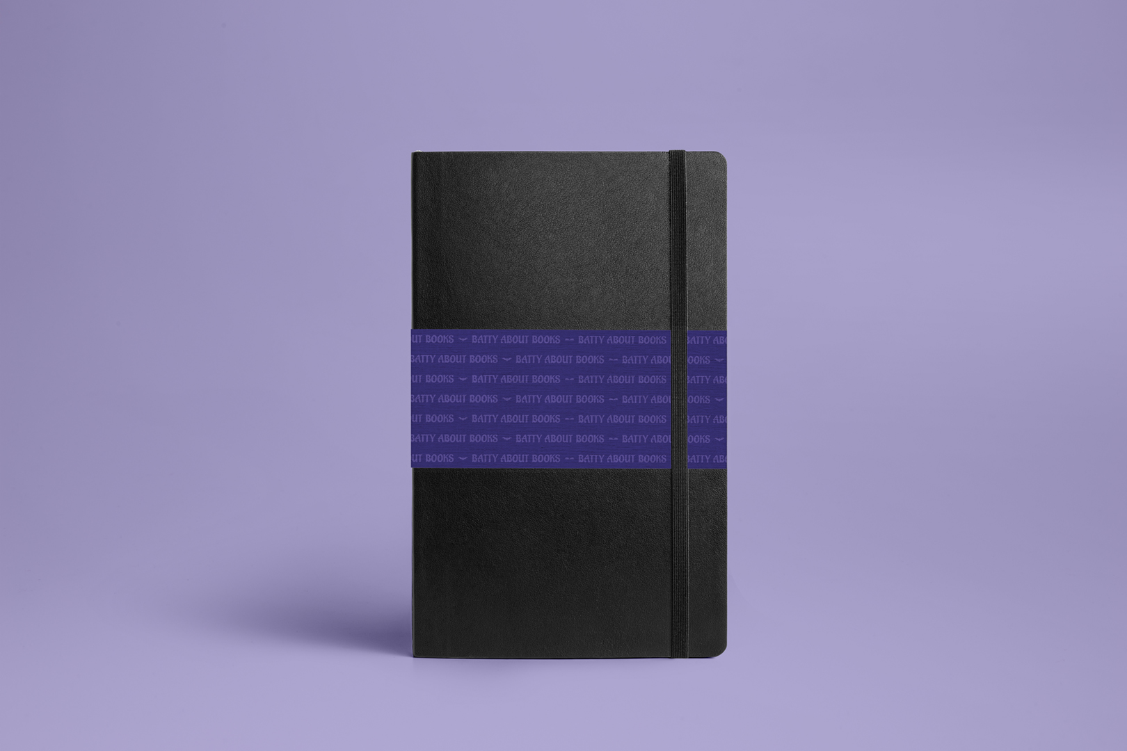
Client requested that the refreshed brand use bats and books for imagery and gem tones (with purple as the primary color) for the color palette.
End Goal
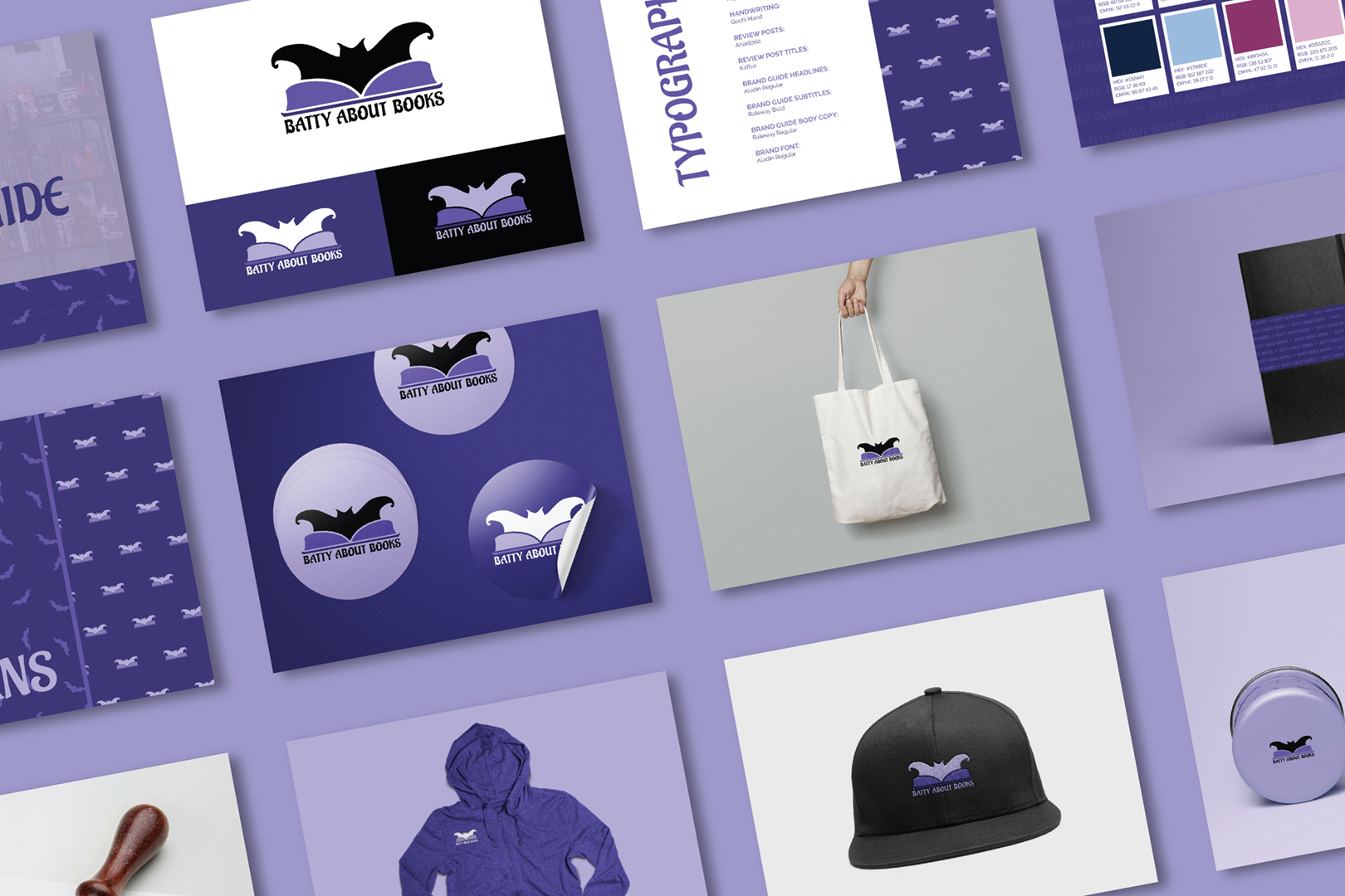
Complete Brand Identity
Logo
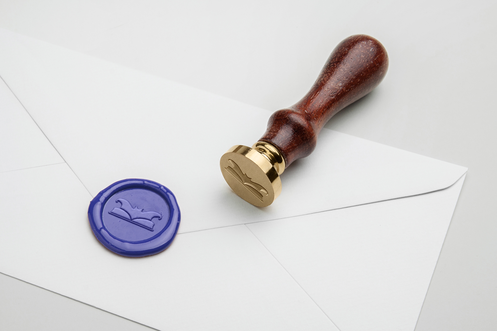
Brand Guide
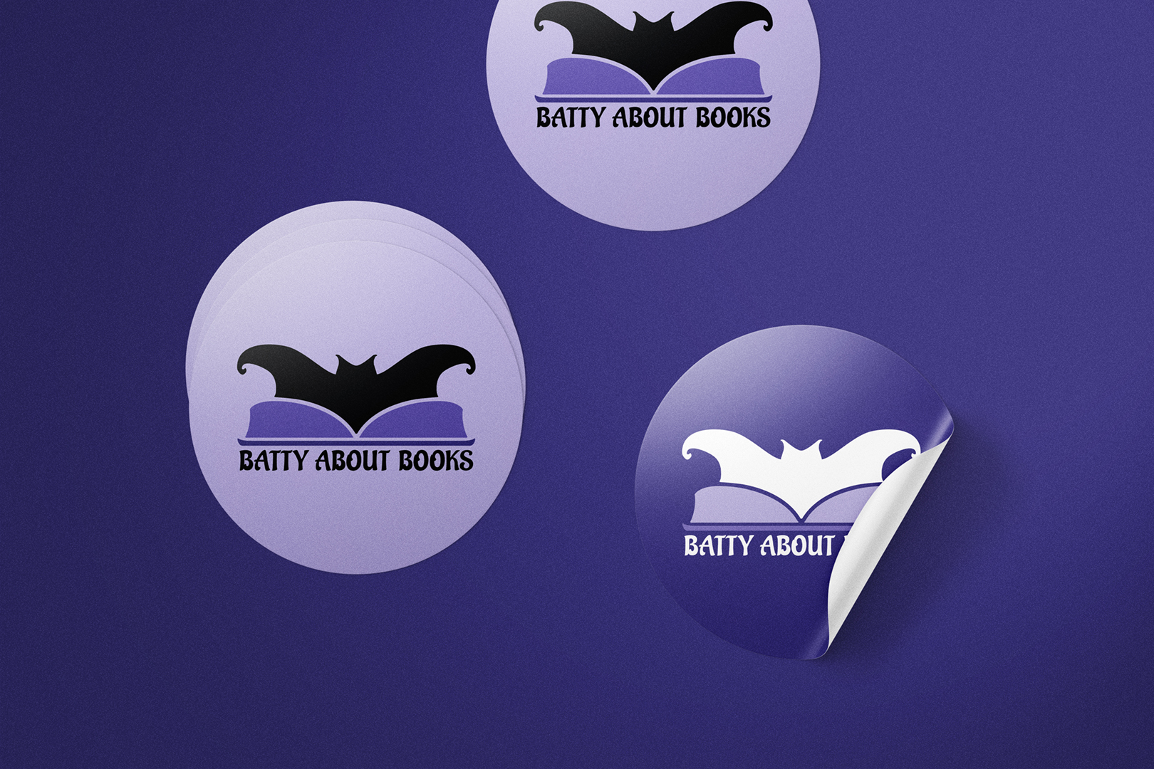
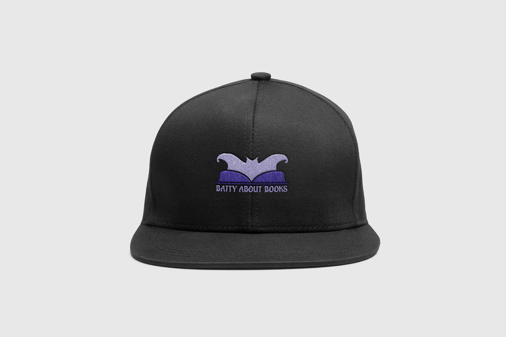
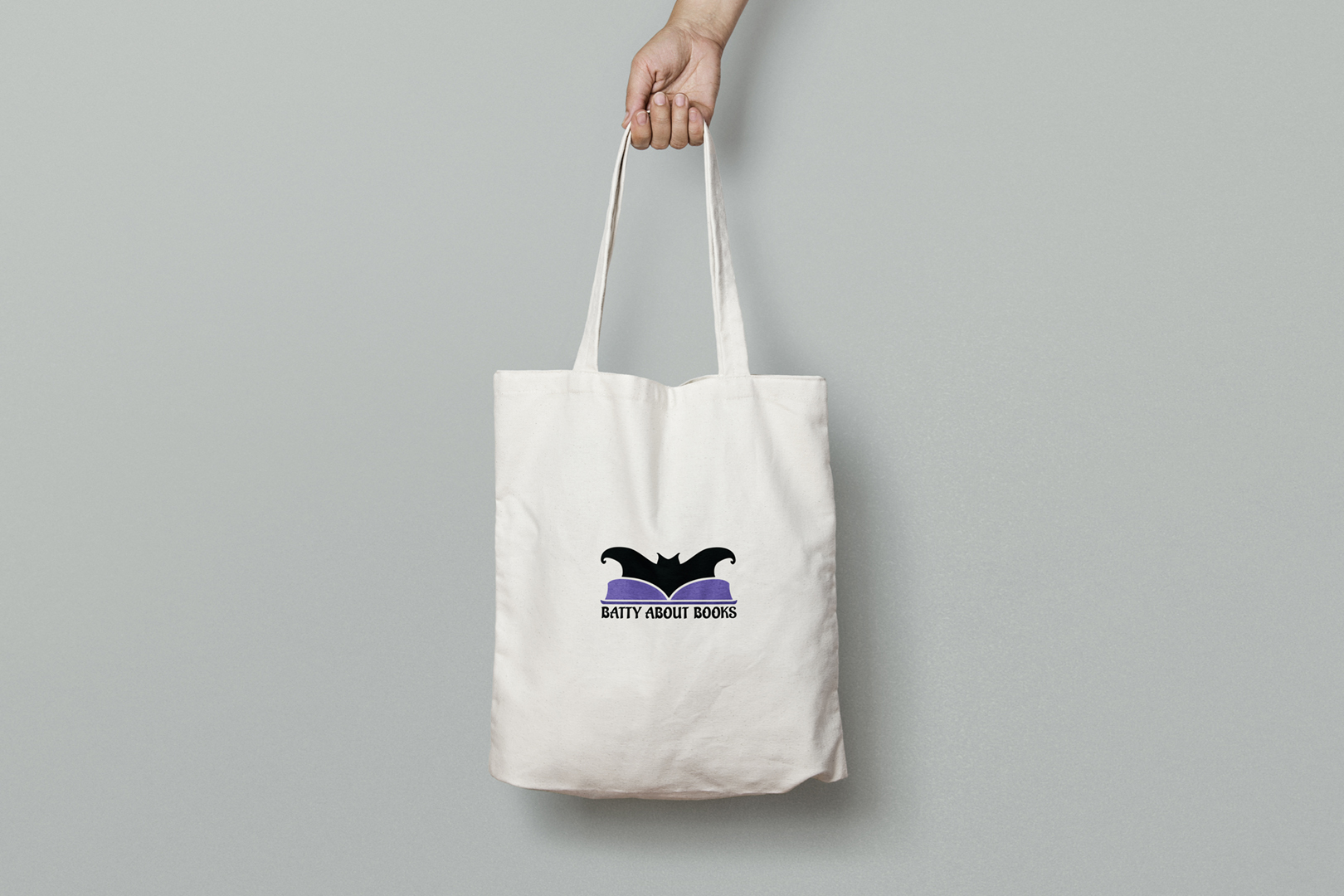
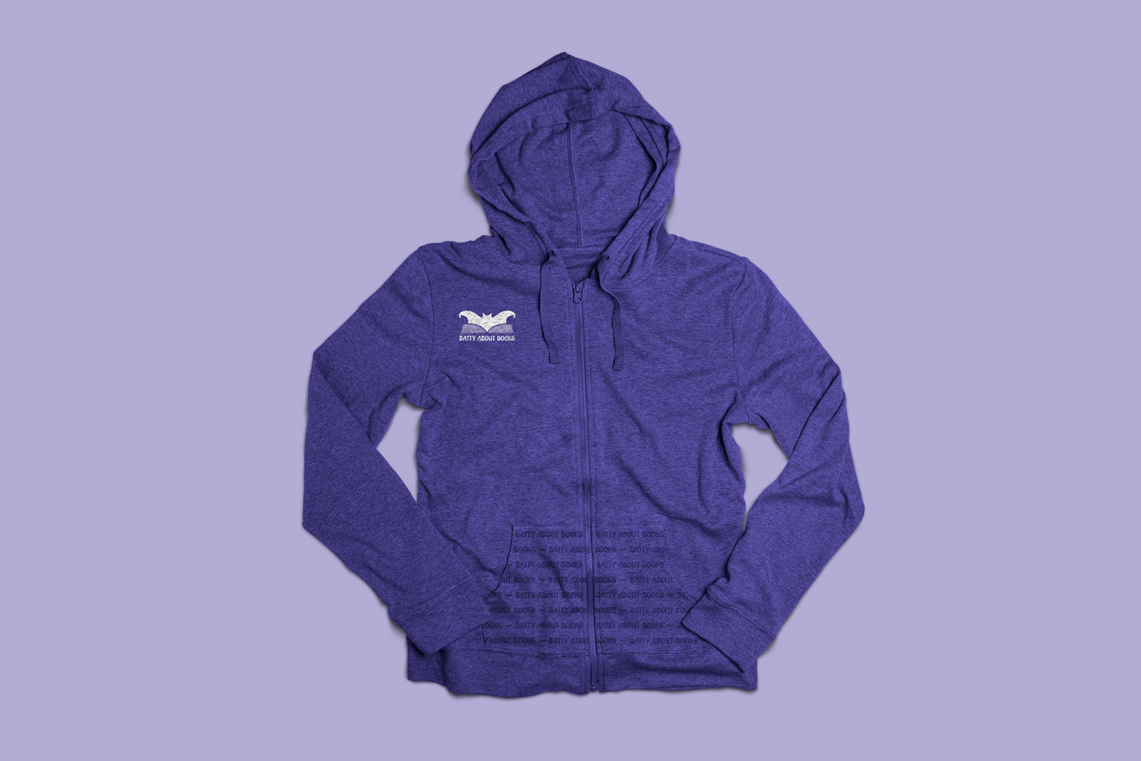
Marketing Collateral
My Process
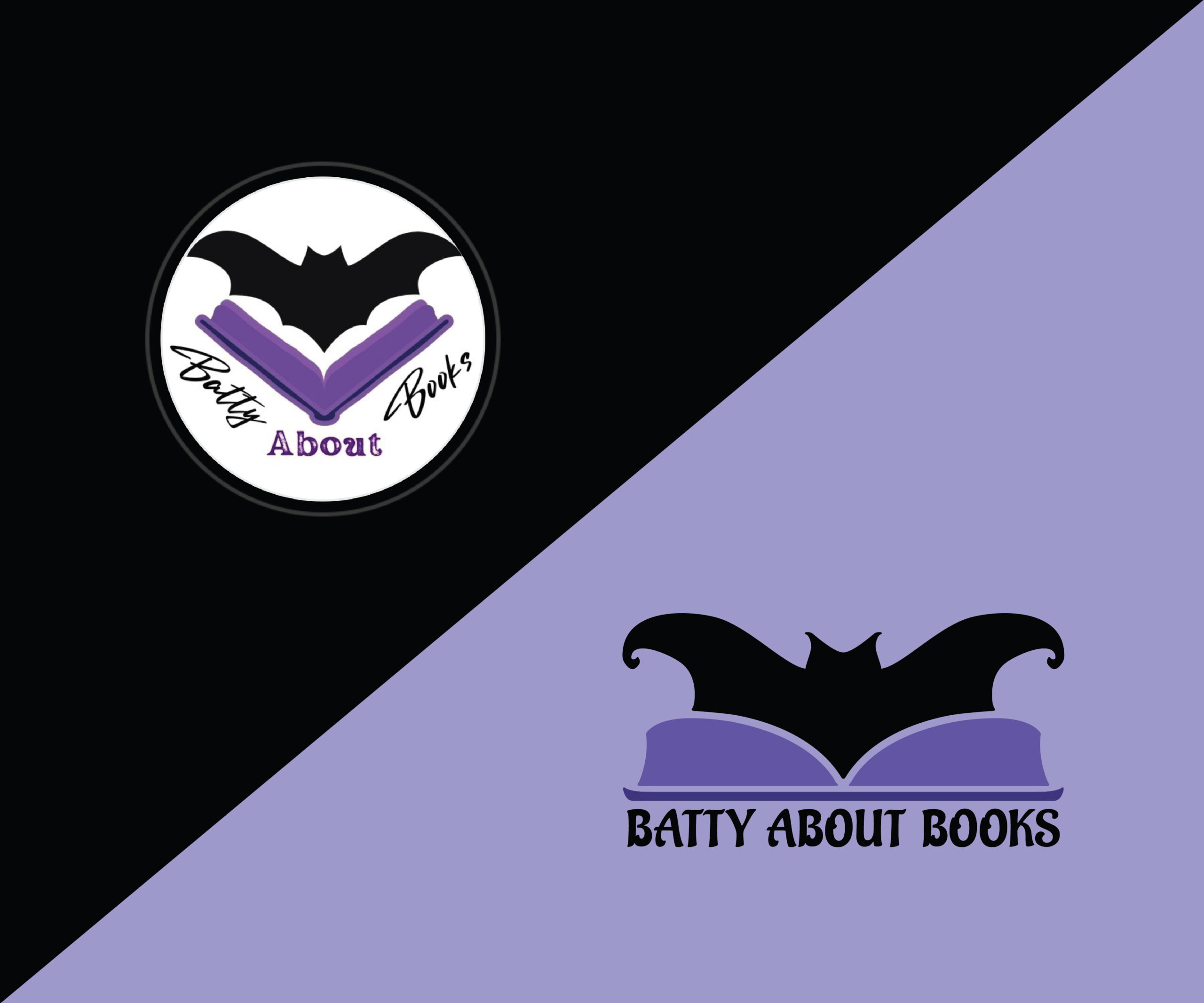
Batty About Books is an online book brand that provides personalized book recommendations, prioritizing diverse and marginalized voices. When the client initially approached me, she already had a logo she’d created using limited resources. We discussed what she wanted to keep from this initial design, which included a bat fitting into the negative space of an open book. After hand-drawing the bat with clean lines, I began pairing it with different fonts, prioritizing clean sans-serifs to ensure the text would remain cohesive with the logo’s imagery.
We soon discovered that while the client loved the newly designed bat icon, the clean sans-serif options that matched the logo didn’t align with her vision. After a discussion, we pivoted toward gothic fonts, which aren’t always legible when used for smaller text. I switched to fonts with more flair that still prioritized legibility and recommended Aladin, which the client fell in love with instantly. However, there were two issues with this font: the weight wasn’t thick enough to match the icon, and there was a severe disconnect between the icon and font styles.
To fix this problem, I took the font and created a custom bold version to ensure the letters’ thick strokes matched the book binding’s thickness. This was crucial to ensure the two appeared united. After brainstorming with a fellow designer, I reconsidered how to make an extremely clean icon match such an expressive font and realized the icon required adjusting. I reviewed the entire alphabet and began cutting pieces, molding them into the bat and book for a cohesive design. The lowercase “f” became the bat ears, the capital “A’s” leg became the tips of the wings, the curve of the “A” guided the wing’s curvature, and the top of the “T” became the book cover sides.
These changes resulted in a clean, cohesive logo that the client fell in love with instantly. Once the logo was set, we completed her brand refresh with a new color palette and merch.


