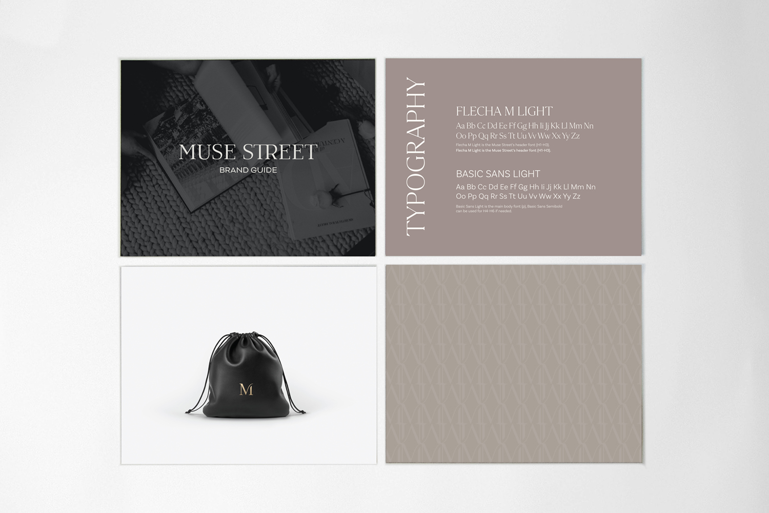
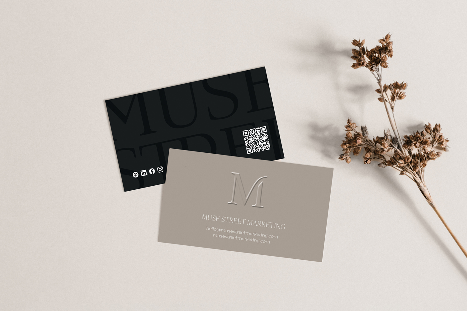
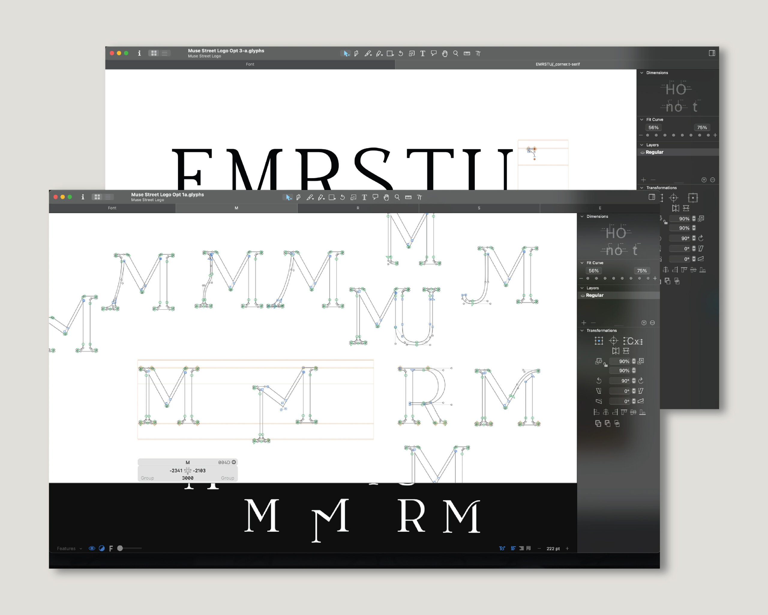
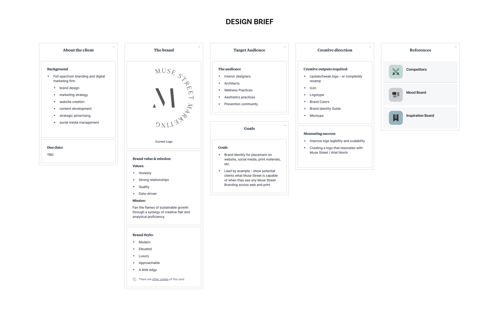
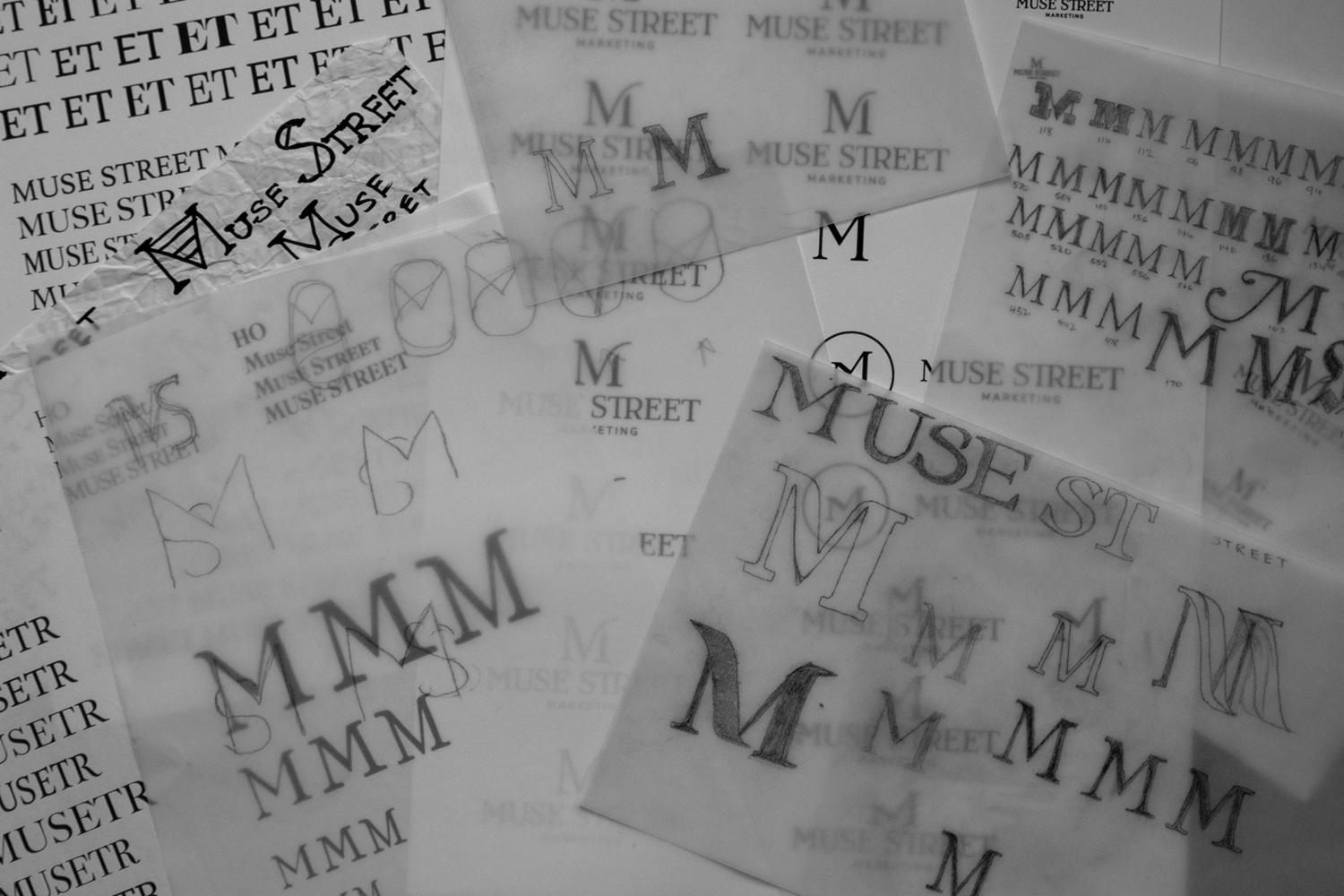
When my boss approached me about rebranding her company, we started by discussing her current logo. After pointing out areas that left room for improvement, I asked if she preferred I fix the existing logo or create a new one. She chose the latter. After deciding to create custom typography, I designed three prototypes. She selected her favorite, which I polished. The icon proved to be the greater challenge, but after some trial and error, we came to an agreement on the final logo.
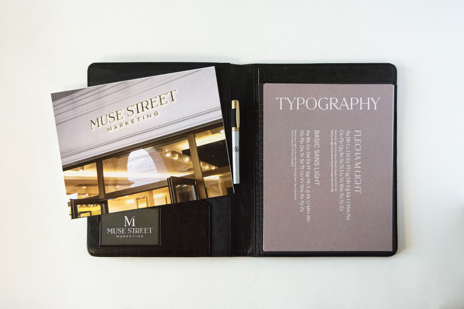
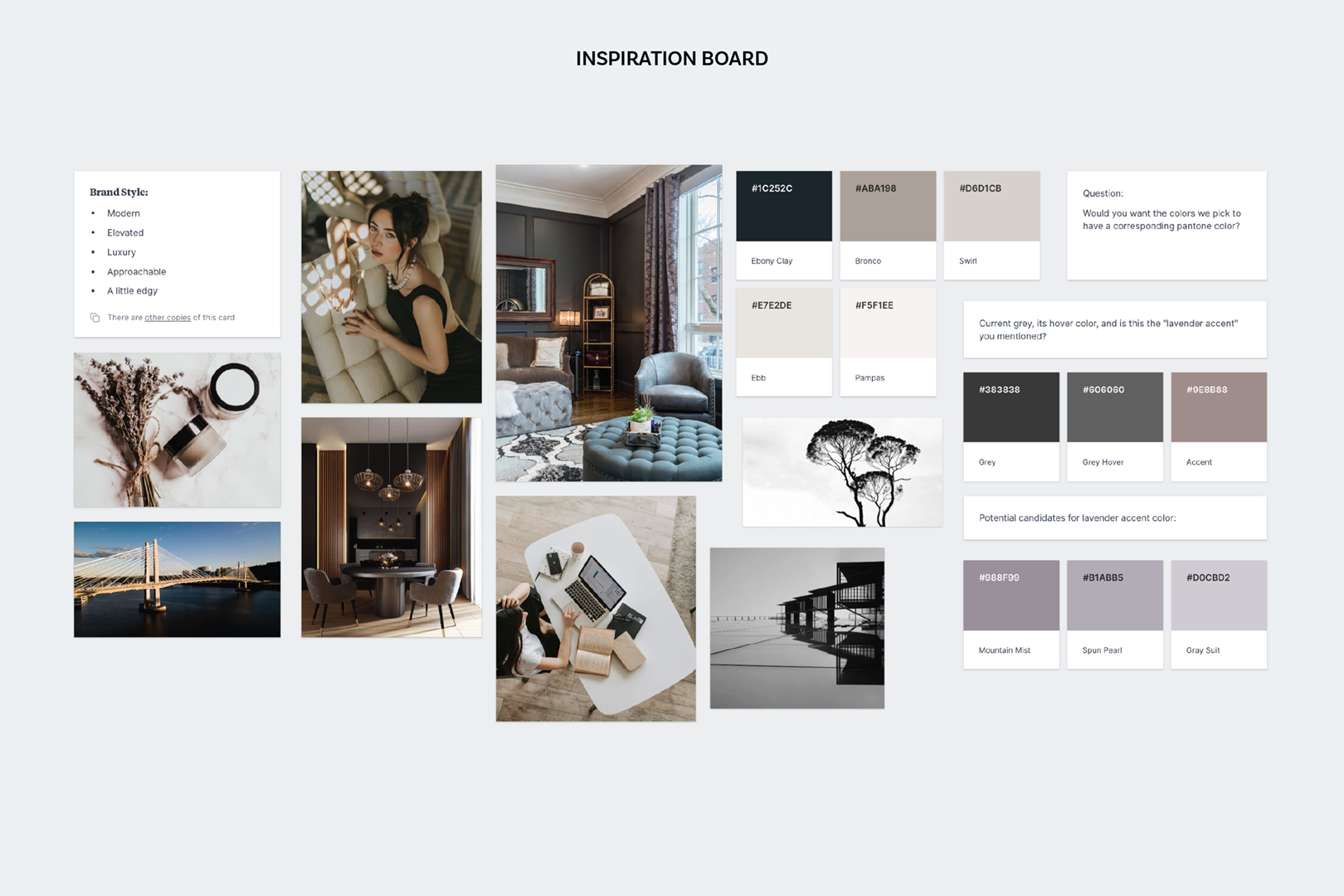
The client had a color palette that she was drawn to; we used it as a base, then fine-tuned it and added two more colors to round it out. The neutral colors represent dependability and trustworthiness; values we wanted to convey within the brand. Afterward, I designed a business card, brand guide, patterns, and more to complete the full re-branding.
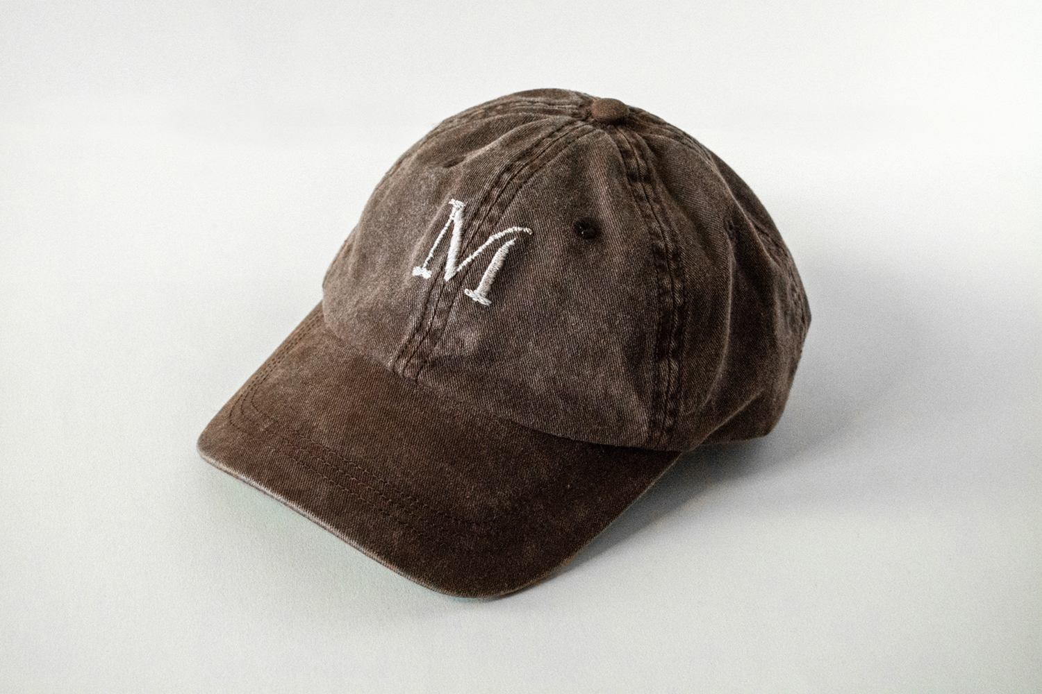
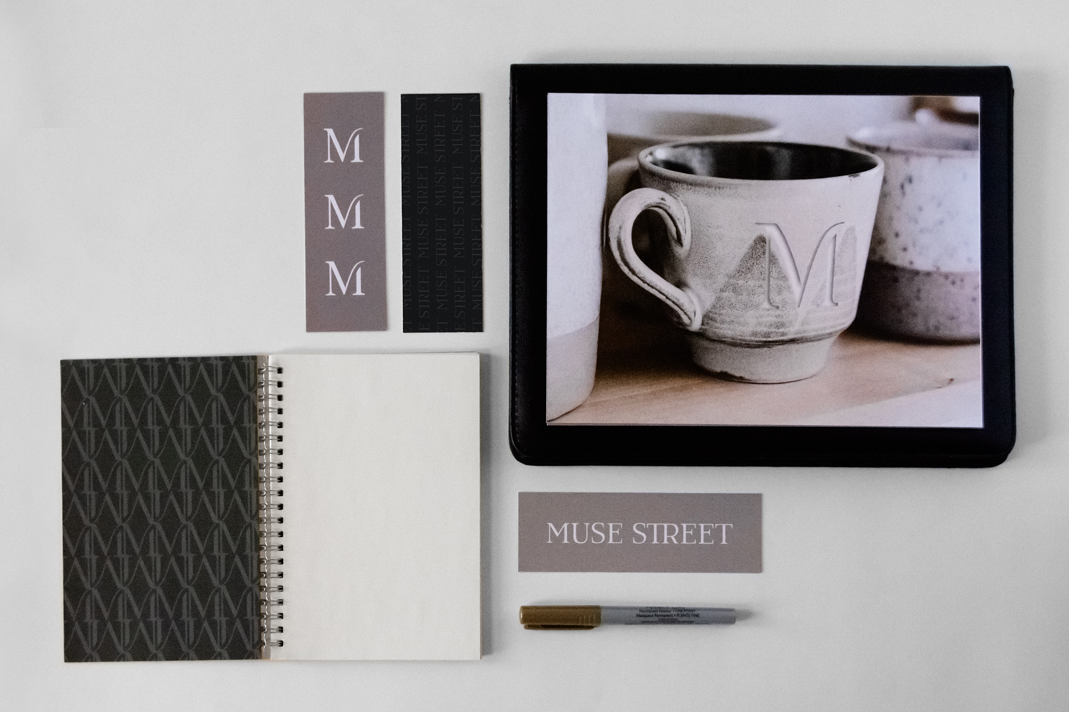
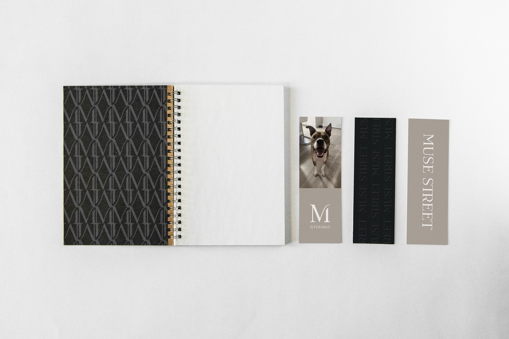
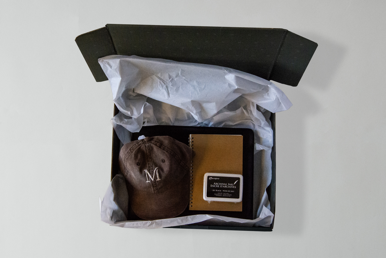
As a surprise, I made a little brand package and mailed it to my boss. It included the brand guide in a black portfolio, a hand-embroidered hat, a little notebook, and some bookmarks (including one with her dog, as she continually likes to widen her perspective and knowledge with reading books). I also ordered a clear stamp of her logo with ink.


